Media Queries Explained: From Mobile to Desktop
Media queries are how you tell browsers to apply different styles at different screen sizes. We’ll walk through the syntax and show you common breakpoints that actually work.
What Are Media Queries?
Media queries are CSS rules that apply styles based on device characteristics—screen width, height, orientation, and more. They’re the foundation of responsive design. Without them, your website looks the same on a phone as it does on a 27-inch monitor.
The basic idea is simple: write CSS that changes when conditions are met. When someone views your site on a mobile device, different styles kick in. When they resize their browser window or rotate their phone, the layout adapts. That’s media queries in action.

Media Query Syntax
Every media query follows the same pattern. You’re checking for a condition, and if that condition is true, the styles inside apply.
Basic structure:
                  @media (condition) {

}
The most common condition is screen width. You’re essentially asking: “Is the screen at least 768 pixels wide?” If yes, apply these styles. The mobile-first approach starts with styles for small screens, then adds more complexity as screens get bigger.

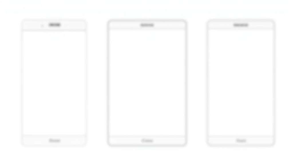
Standard Breakpoints That Work
You don’t need dozens of breakpoints. Most responsive sites use 3-4 breakpoints that cover the majority of devices. These are the breakpoints we recommend based on actual device usage.
Single column layouts, touch-friendly buttons, readable text without zooming. This is your default styling before any media queries.
Two-column layouts start working. You’ve got more horizontal space. Images can be larger. Navigation can expand from hamburger menus.
Multi-column layouts, sidebars, wider typography. Full navigation visible. You’ve got room for everything. Don’t overthink this—most desktop users are on screens between 1200-1920px.

Practical Example: Building a Responsive Navigation
Here’s how media queries work in a real-world scenario. You’re building a navigation bar that shows full menu links on desktop but collapses into a hamburger menu on mobile.
Mobile First: Hide the Full Menu
Start with the mobile view. The full navigation is hidden by default, and you show only the hamburger button. This keeps your default CSS simple and fast-loading.
Tablet Breakpoint: Transition Phase
At 768px, you’ve got more room. You can show some navigation items inline while still keeping others in a dropdown. This is where you test what fits without cramming things together.
Desktop: Show Everything
Above 1024px, you show the full navigation horizontally. The hamburger button disappears. Everything’s visible, and you’re not wasting space anymore.
What You Can Control with Media Queries
Media queries aren’t just about hiding and showing elements. You can change almost anything about your design based on screen size.
Layout & Grid
Change from single-column on mobile to multi-column on desktop. Adjust flex directions, grid templates, and column widths.
Typography
Scale font sizes up on larger screens. Adjust line-height and letter-spacing for readability. Headlines can be bolder on desktop.
Images & Media
Load different image sizes at different breakpoints. Change aspect ratios. Show or hide images based on screen size.
Colors & Spacing
Adjust padding and margins for different screen sizes. Change background colors. Modify shadows and borders for mobile optimization.
Visibility
Hide elements on mobile that take up too much space. Show desktop-only content. Use display: none strategically.
Interactions
Adjust button sizes for touch targets on mobile. Change hover states. Modify interaction patterns based on device capabilities.
Tips for Writing Better Media Queries
You can write media queries that work, or media queries that maintain your sanity. Here’s what we’ve learned from building responsive sites for years.
Start with mobile, then add complexity
Write your base styles for mobile screens first. Then use media queries to enhance the design for larger screens. It’s cleaner, faster, and easier to maintain. You’re building up, not removing things.
Use min-width, not max-width
@media (min-width: 768px) works better than @media (max-width: 767px). Min-width cascades naturally and is easier to debug. You build from small to large, not large to small.
Stick to your breakpoints
Don’t create a new breakpoint every time something looks slightly off. Stick with 3-4 main breakpoints. If you’re adding 10+ breakpoints, you’re probably overthinking the design.
Test at actual breakpoints, not in between
When testing your site, check it at 320px, 640px, 768px, 1024px, and 1440px. Don’t just resize the browser randomly. You’ll catch issues at the actual breakpoints where your styles change.

Making Media Queries Work for You
Media queries aren’t complicated once you understand the pattern. You’re checking conditions and applying styles based on those conditions. It’s that simple. Start with mobile styles, use 3-4 breakpoints, and test regularly.
The key thing to remember: you’re not building separate sites for mobile and desktop. You’re building one flexible site that adapts. Media queries are how you tell the browser how to adapt. They’re the connective tissue between your design and reality—the messy, diverse reality of devices with different screen sizes, orientations, and capabilities.
Quick reminder: Mobile first, min-width breakpoints, 3-4 main sizes, test at actual breakpoints. That’s 90% of what you need to know about media queries.


About This Guide
This article is educational material designed to help you understand media queries and responsive design principles. While we’ve covered the most common practices and breakpoints, every project is unique. Your specific needs might require different breakpoints or approaches based on your audience, content, and business goals. We recommend testing thoroughly with real users and real devices. Browser support, device capabilities, and user behaviors evolve—stay updated with current best practices from organizations like the W3C and MDN Web Docs.