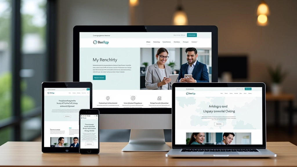
Building Responsive Digital Experiences Across Malaysia
FlexLayout Studio Sdn Bhd specializes in responsive web design and mobile-first development. We’re committed to creating websites that work beautifully on every device, every screen size, every browser.

What We Know Best
Since 2019, FlexLayout Studio Sdn Bhd has been helping Malaysian businesses create adaptive layouts that engage users across devices. We’re not just building websites — we’re building experiences.
Mobile-First Strategy
We design for phones first. Tablets and desktops follow naturally. This approach ensures your site performs brilliantly where most users actually browse.
Adaptive Layouts
CSS Grid, Flexbox, and intelligent breakpoints work together. Your content reflows smoothly from 320px phones to 4K monitors without compromise.
Media Queries Mastery
We write smart media queries that anticipate device behavior. Not just breakpoints — contextual design that responds to real user needs.
Cross-Device Testing
Every site gets tested on real devices. We don’t assume — we verify. Android, iOS, various browsers, different connection speeds. All covered.
Performance First
Responsive doesn’t mean slow. We optimize images, minimize CSS, and structure HTML efficiently so sites load fast everywhere.
Accessibility Built-In
Responsive design isn’t just about screens — it’s about people. We follow WCAG standards so your site works for everyone.
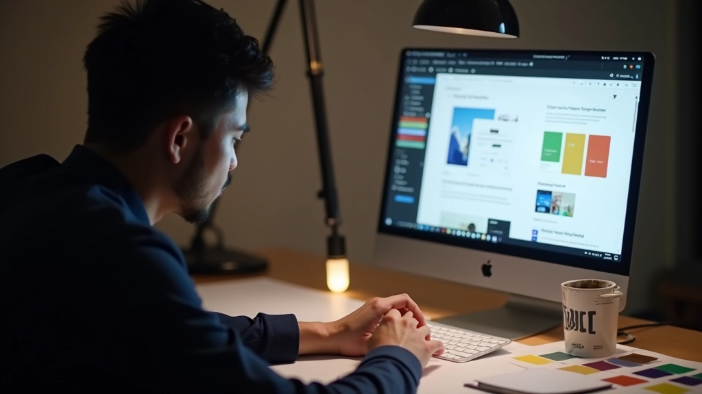
How We Build Responsive Sites
Strategic Planning Meets Technical Excellence
We don’t start coding. We start with questions. What’re your users doing? Which devices matter most? What’re your performance goals? This isn’t overthinking — it’s smart planning.
FlexLayout Studio Sdn Bhd has worked with over 150 companies across Malaysia. We’ve learned what works. Fluid typography. Intelligent images. CSS variables for maintainability. Container queries for future-proof design.
Your site gets built on semantic HTML. Flexbox and Grid handle layout. Mobile viewport comes first, then we enhance for larger screens. It’s a progressive approach that’s been proven effective.
Discovery & Strategy
We audit your current presence, understand your audience, and identify responsive design opportunities specific to your business and market.
Design & Wireframing
Wireframes show layout behavior across breakpoints. We define your adaptive grid, test touch targets, and plan content reflow before any code gets written.
Development & Testing
Mobile-first HTML and CSS. We test constantly on real devices, real browsers, real connection speeds. No surprises at launch.
Optimization & Delivery
Final performance tuning. Image optimization. CSS minification. We hand over a site that’s fast, accessible, and ready for real traffic.
What Sets FlexLayout Studio Sdn Bhd Apart
Malaysia-Based Expertise
We understand the Malaysian market. Local infrastructure, user behaviors, and business priorities. We’re not a generic agency — we’re invested in this region.
Practical Guides & Documentation
You’ll get more than a website. We provide documentation on responsive practices, media query logic, and maintenance guidelines so your team can manage updates confidently.
Real Device Testing
We don’t rely on browser emulators. Testing happens on actual Android phones, iPhones, tablets, and various browsers. Real results, not simulated ones.
Future-Proof Approach
We use modern CSS features carefully. CSS Grid for complex layouts. Flexbox for component alignment. Container queries where appropriate. Your site stays relevant as web standards evolve.
Performance That Matters
We’ve seen how slow sites hurt conversions. Every project includes performance optimization. Smaller bundles. Faster load times. Better Core Web Vitals.
Ongoing Support
Launch isn’t the end. We’re available for questions, updates, and refinements. Your responsive site evolves as your business needs change.
Important Information
The information provided on this website is intended for educational and informational purposes regarding responsive web design principles, mobile-first development practices, and cross-device compatibility. While we strive to provide accurate and practical guidance, individual implementation results may vary based on specific project requirements, existing infrastructure, and technical team expertise. We recommend consulting with qualified web development professionals to assess how these principles and practices apply to your unique business needs and technical environment. FlexLayout Studio Sdn Bhd does not guarantee specific outcomes or results from implementing the methodologies and practices discussed on this site.